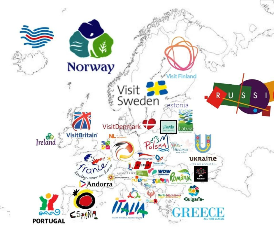
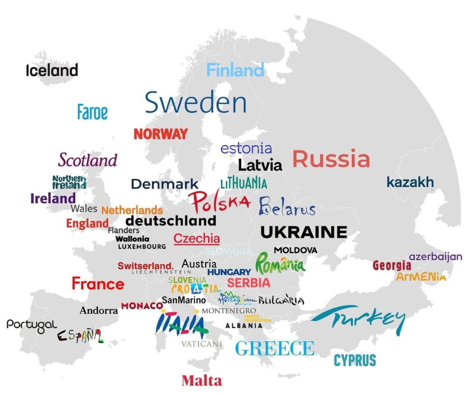
Allure in miniature: logos and slogans are the most concise form of nation branding. Countries around the world are trying to present themselves in the best possible light. A selection.
A good tourism logo reflects the essence of the tourism offer and thus awakens the desire to travel – regardless of whether it is a destination, a travel agency or a tour guide. The design should be inviting and authentic thanks to carefully coordinated colors, fonts and icons.
Small, sometimes wow. Colorful and inviting, or simple and easy.
Turespaña, the Spanish tourism board, has used the vibrant Sol de Miró logo created by the artist Joan Miró for 40 years, since 1983.

The lettering in the Italian logo is almost as vibrant and expressive as that of Spain, while Greece draws on its classical history with an elegant, stately all-caps serif. Many of the fonts chosen by northern and western European tourism boards look starkly reserved in comparison to those in the east and south. Modern, minimalist, they allow color and the message itself to do the work.

After all and especially when it come to branding and logo design in tourism, a well designed company logo locks good on T-shirts, caps and other merchandise and marketing hardware.

